|
|
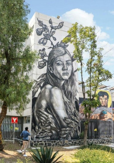
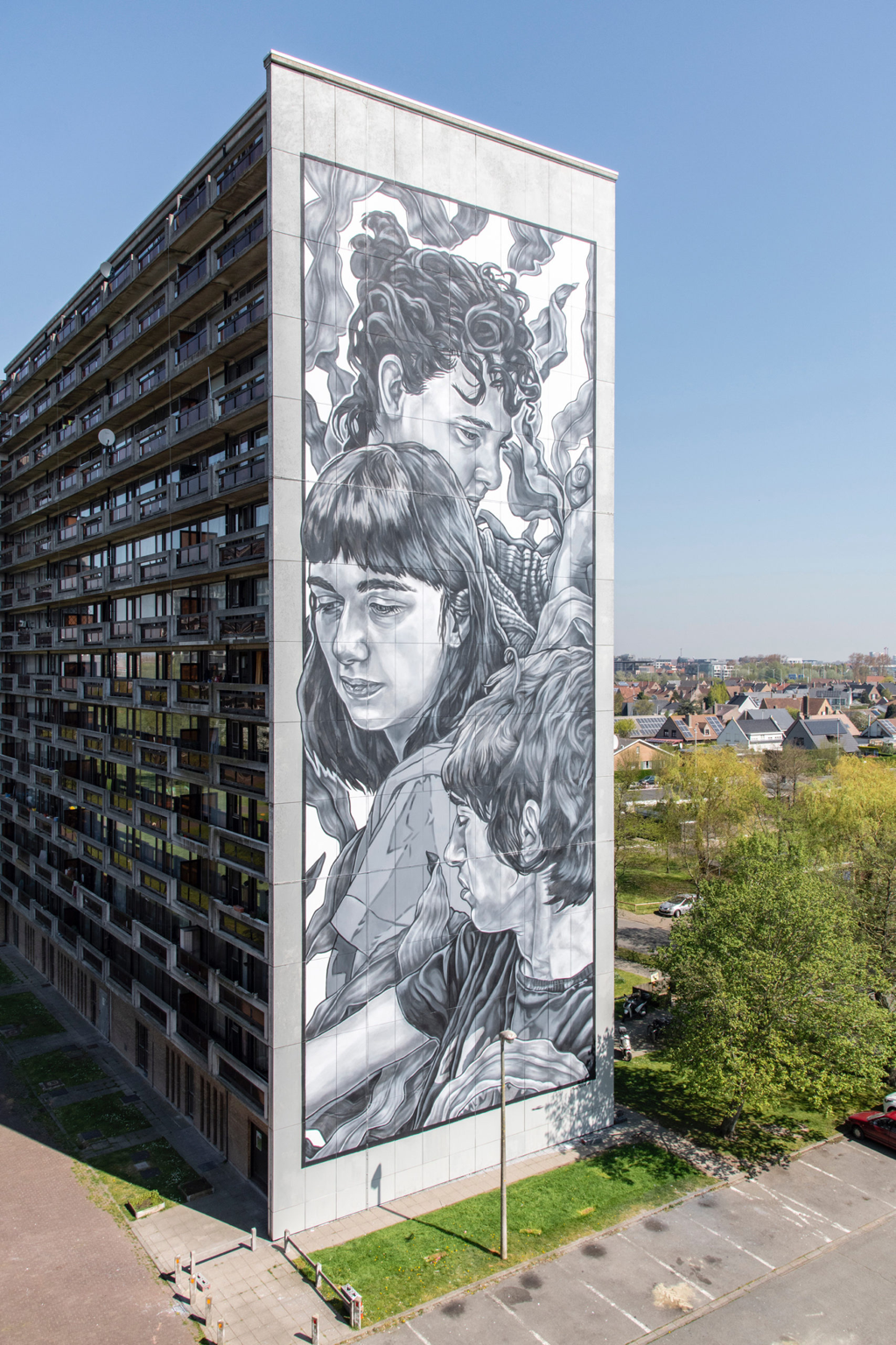
INspired artistI was inspired by the artist Paola Delfín. Paola Delfín is a Mexico-based artist that is well-known for her monochromatic murals, but also creates other street art. She graduated from the University of Belgrade as a political science major, and is currently a journalist. Delfín uses organic art materials, spray cans, and other unique materials in her art work. Her artwork spreads ideas of strong women and the importance of remembering ancestors. Paola Delfín focuses on how to create an impact on those who view her work, while also making a beautiful piece of art. Paola Delfín inspired me because her artwork is extremely beautiful, but also has deeper meaning behind them. I love her focus on representing empowered women and families in her artwork.
Intro to Drawing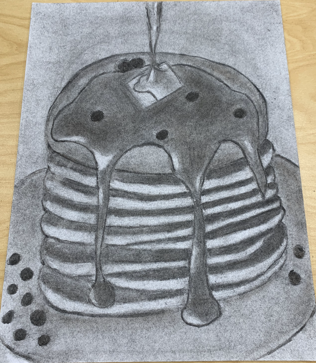
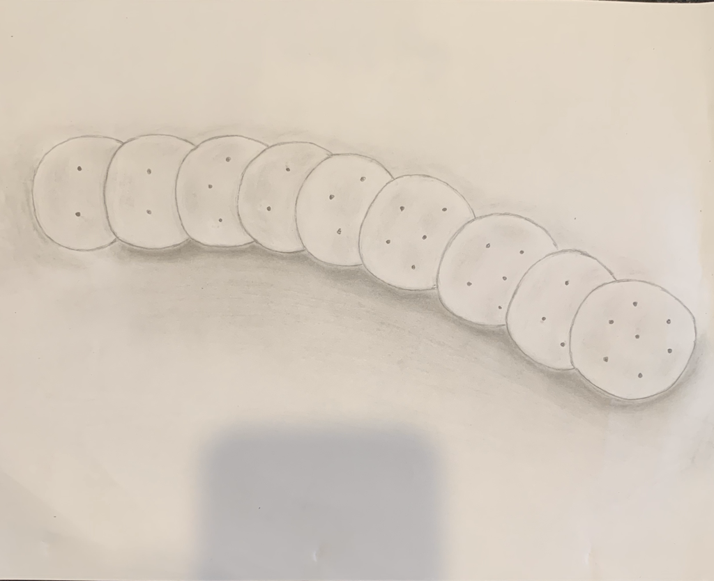
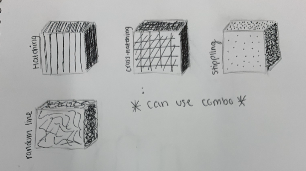
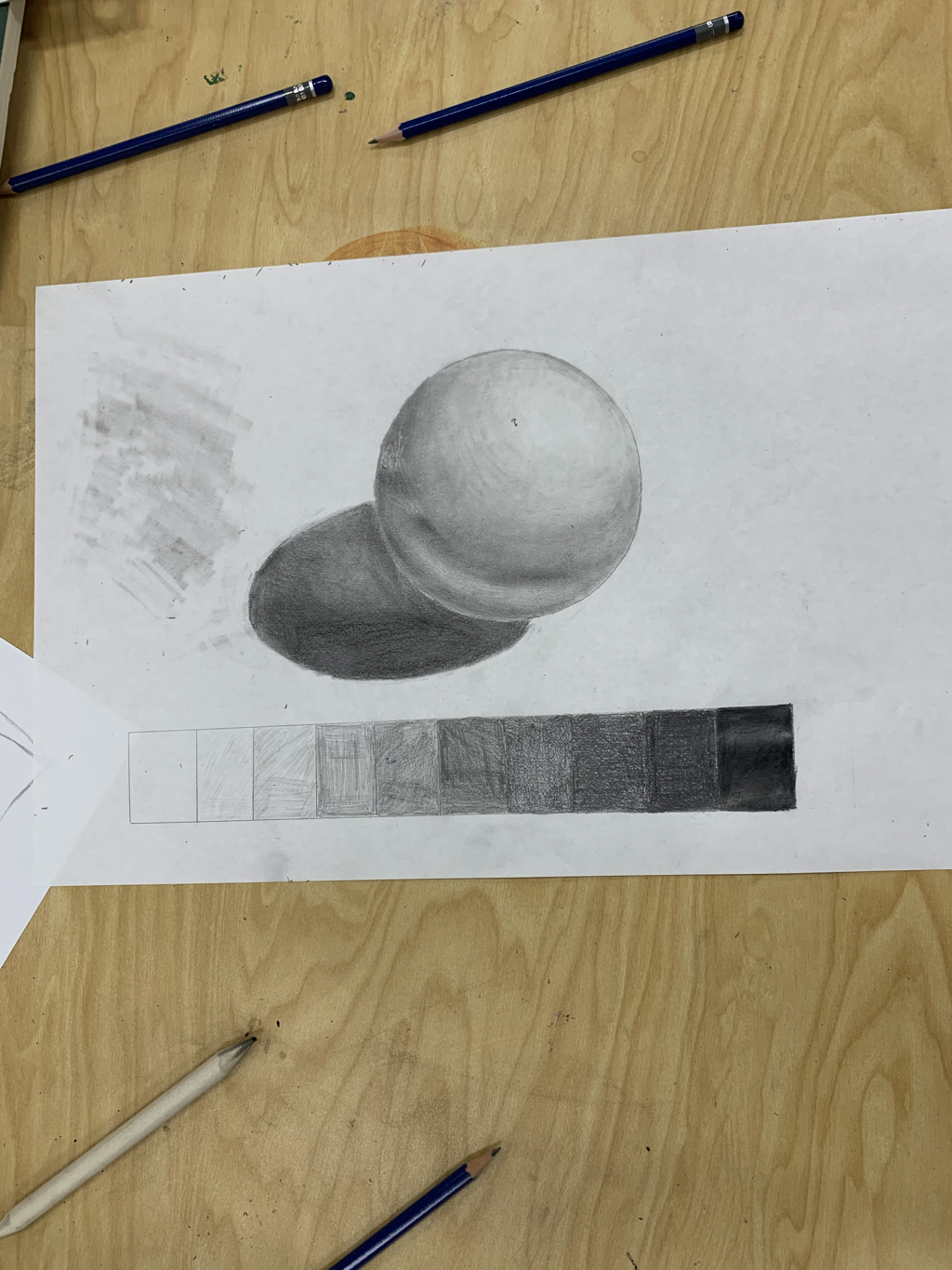
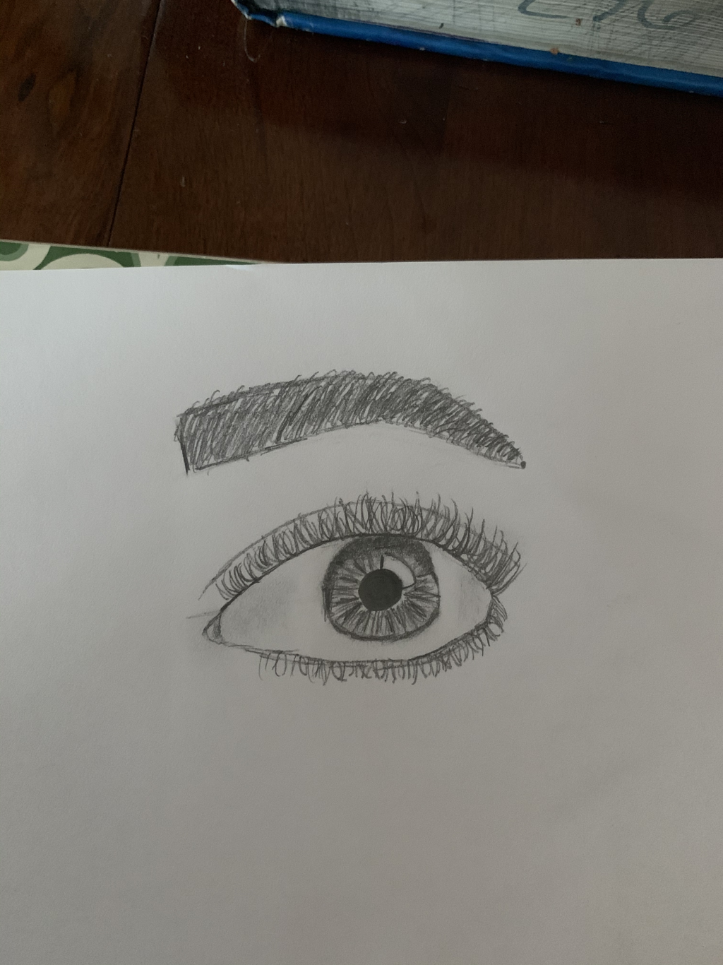
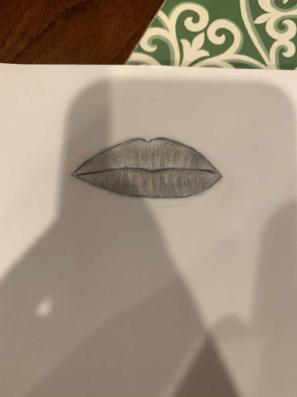
1. The two most helpful warmups to me was the stippling cubes and the sphere drawing. These were the most helpful because the stippling taught me all the different forms of stippling I could use and how to do them correctly. The sphere drawing was helpful because it helped me get more comfortable with shading a drawing and adding values.
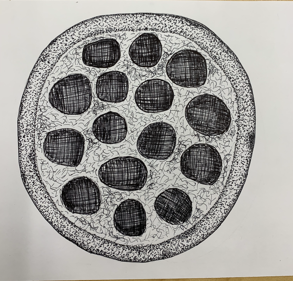
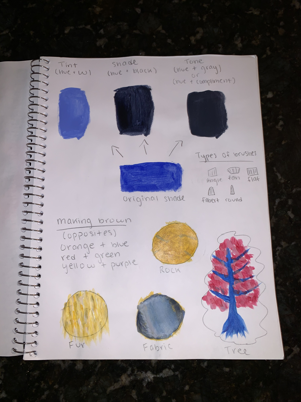
2. Composition- the use of different art techniques and elements to create a piece of art Value- the light and darks in a piece of art, some spots are lighter and some spots are darker to add a element of definition/shape to the picture 3. Charcoal- pro is it is very easy to blend and fix mistakes, but a con is it’s very messy and can be hard to make distinct shade differences Stippling- pro is that it can add lots of detail and value, but the con is that it can take a long time Pencil- pro is that can fix your mistakes and add detail easily, but a con is that it can be tedious and difficult to blend The ideA of place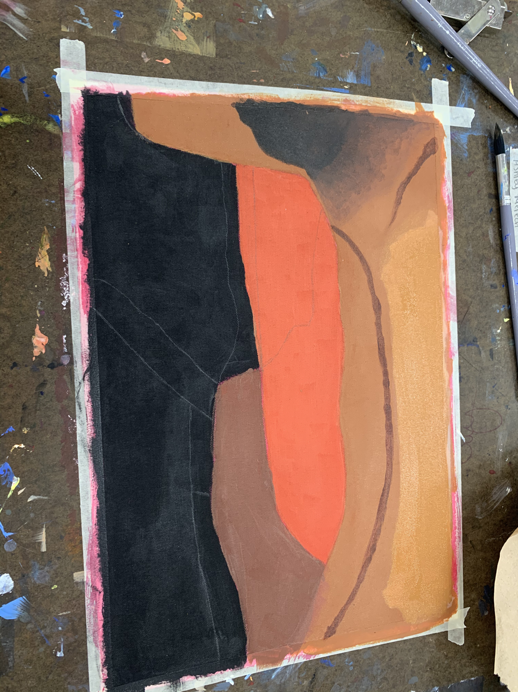
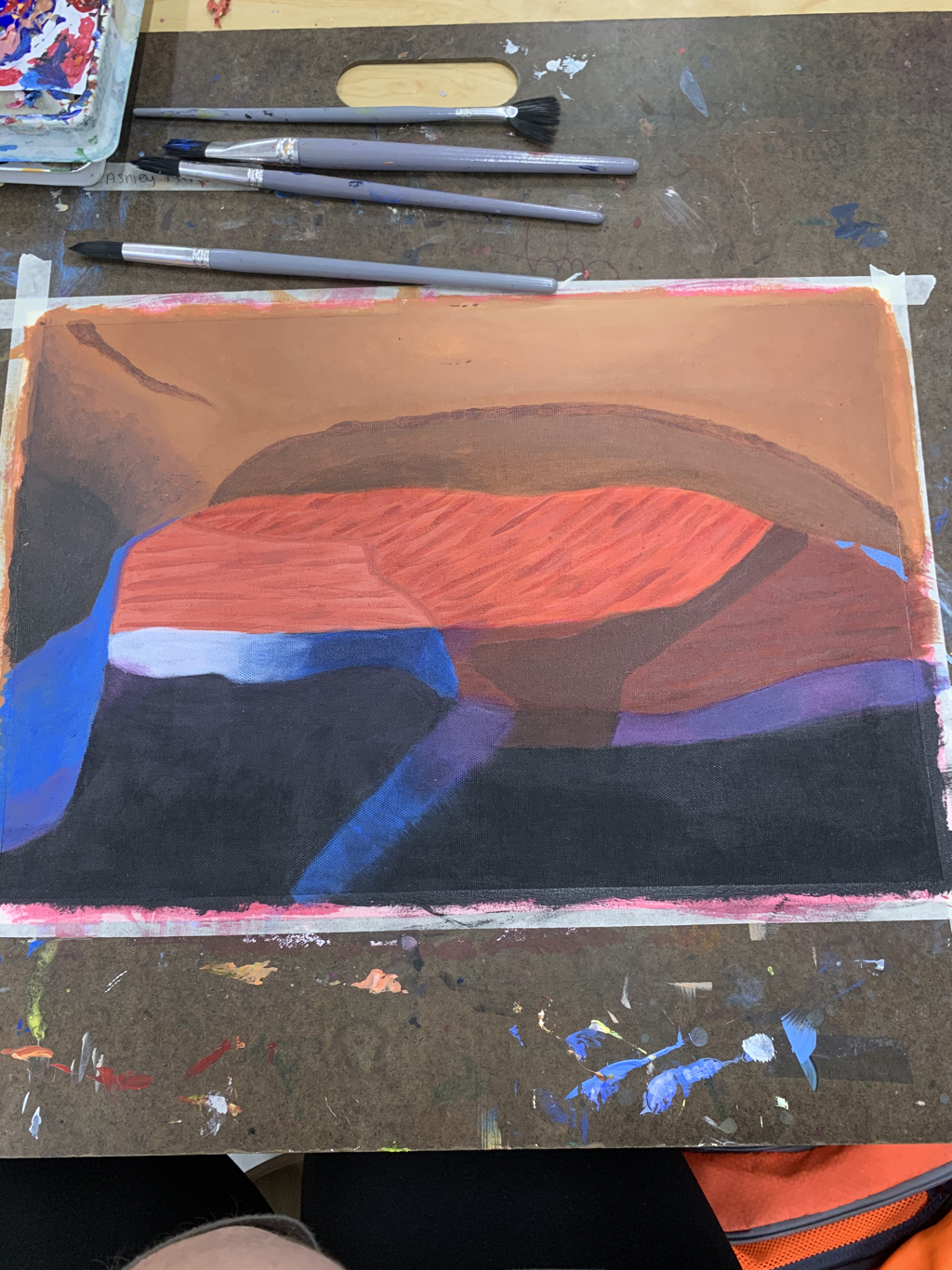
1. The most helpful was the textures of painting warmup because I ended up using those techniques in my painting.
2.The most challenging thing about the picture I picked was either all the blending of the rock or the light ray in the picture. 3. The things I find most successful about my piece is the color matching and the texture I was able to make on my rocks. 4. The first thing I did was separate all the sections with pencil, then painted the main color or each section. After that I worked section but section on all the details needed, so like for the top section I needed to blend in the black and lighter brown. For the middle I needed to focus on the rock textures. For the bottom I needed to do the light rays. Portrait drawing unit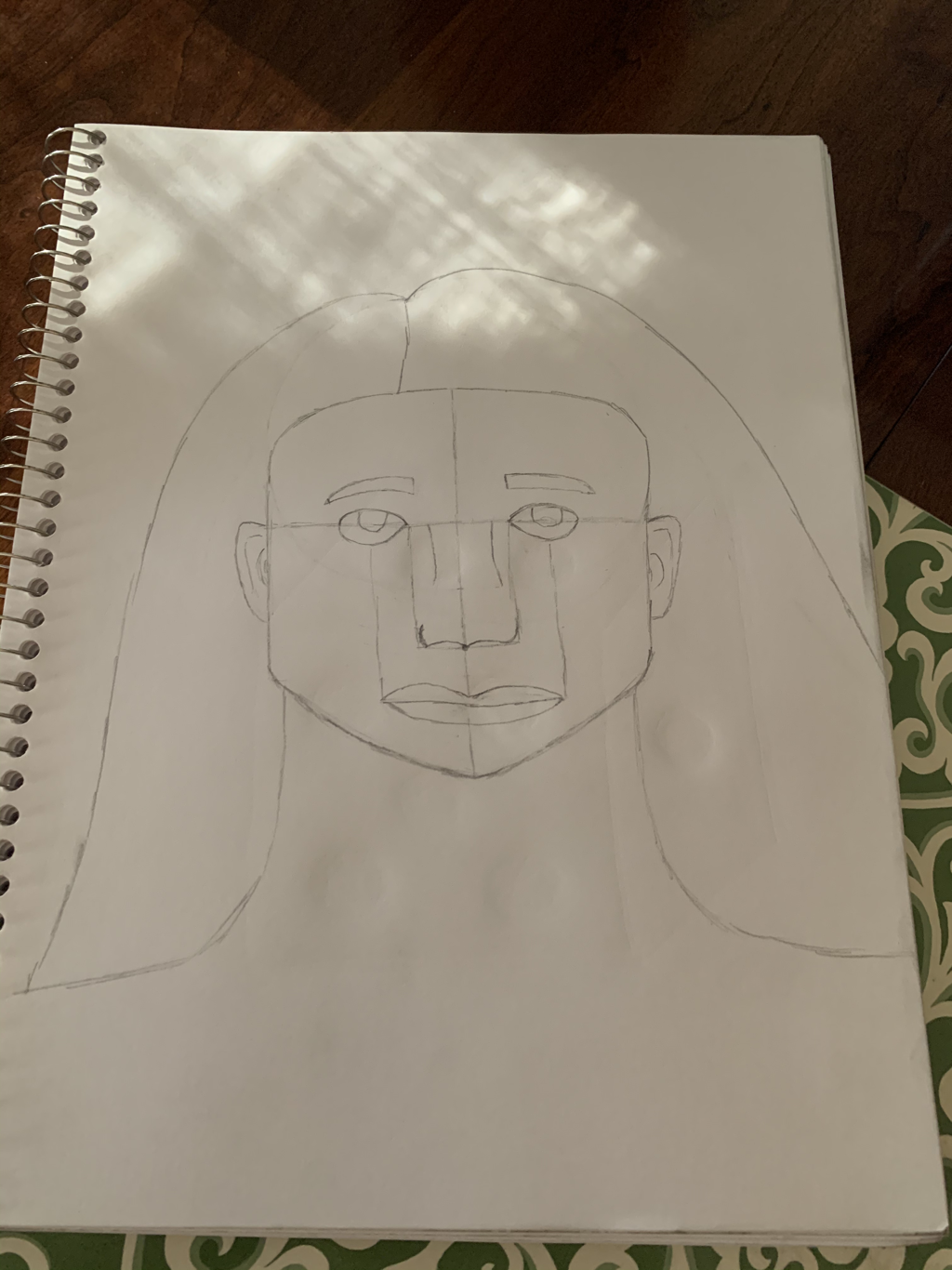
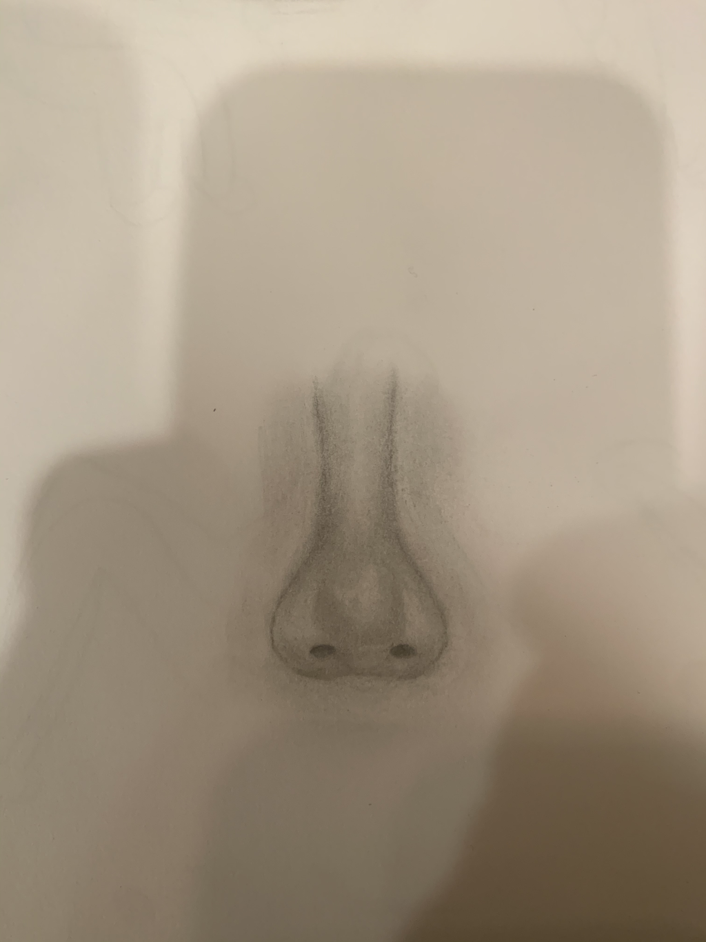
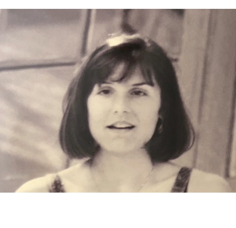
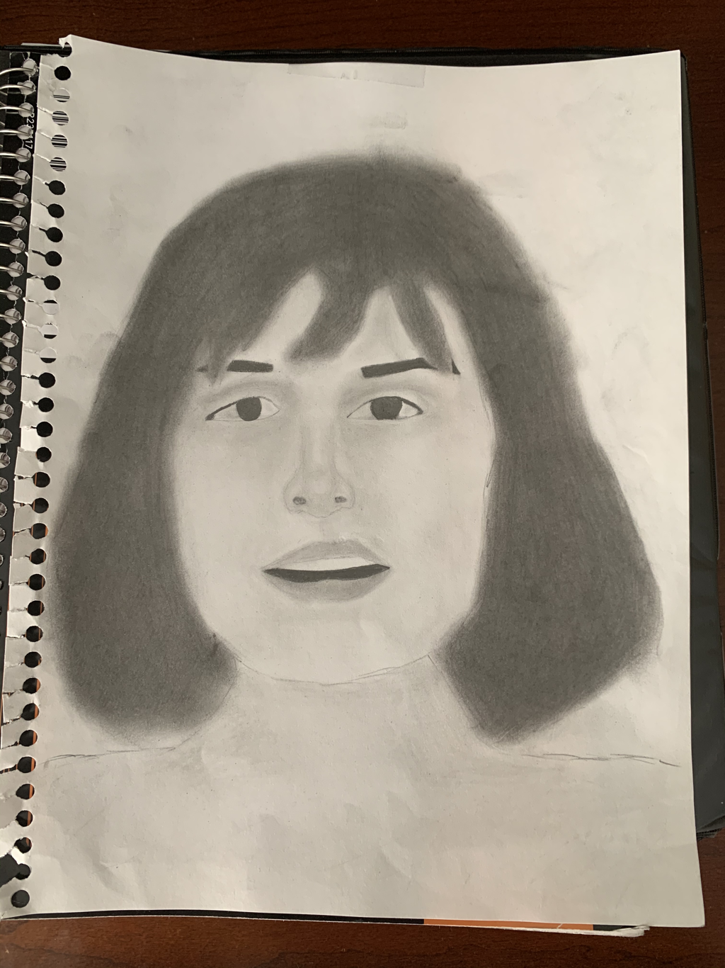
1. I would describe my art piece as a portrait drawing of my mother. This photo was taken years ago at the rehearsal dinner for her wedding.
2. The shape of everything in my picture was me trying to copy how all my mom facial features looked in the picture, especially cause she was moving her face while the picture was being taken. 3. Proportion was very important to me because when the features of the face and the shape of the face aren’t matching, it can really make the portrait seem off or wonky. 4.My mother is the inspiration behind my piece, she is such a great mom and I wanted to show my appreciation for her. I think you can see that in the portrait because the picture I used is very old and low quality, but I was still able to make out all my mom facial features because I know what my mom looks like. 5.I think I did a good job getting all the shapes/sizes of everything correct in my portrait. 6.I learned how to draw living things/people more realistically. PhotOgraphy- moment in timeWarmup-
Project
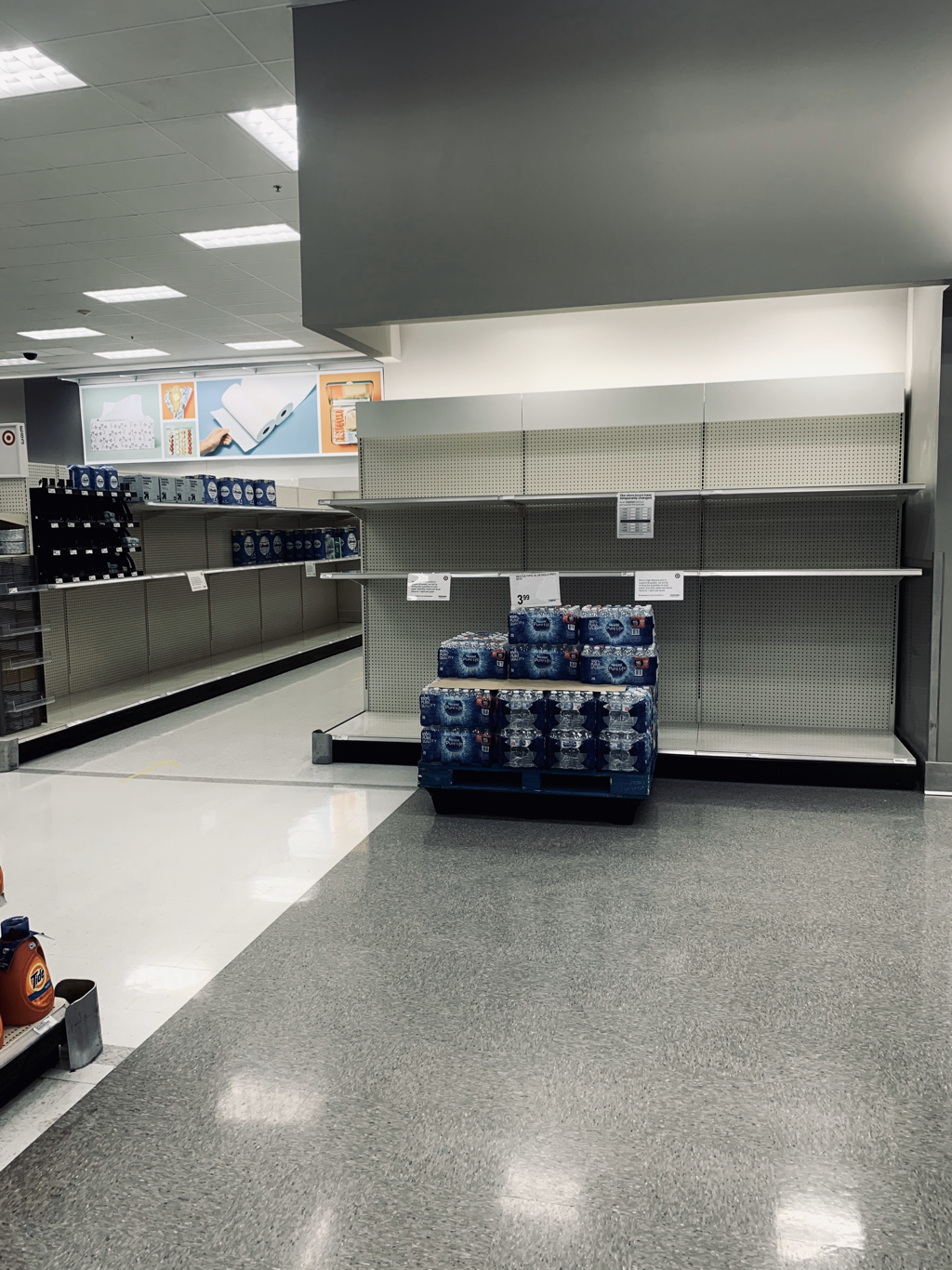
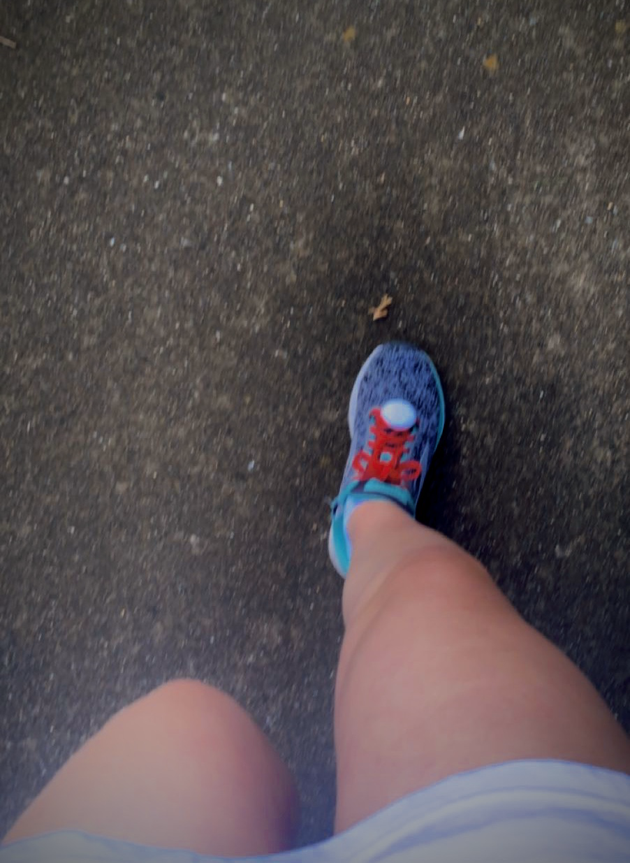
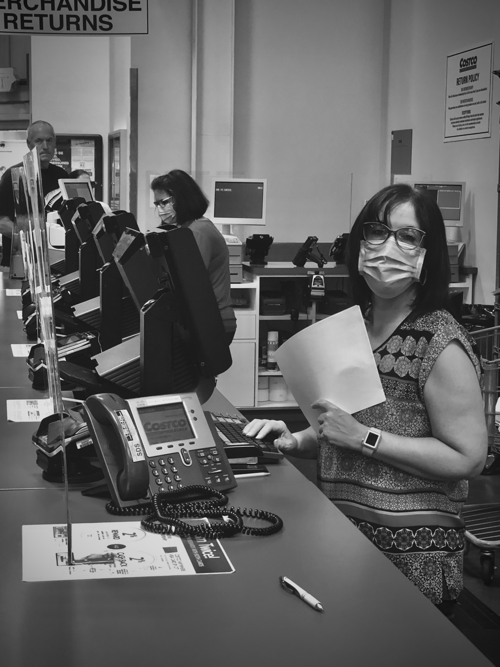
1. My project is 3 photos of my perspective of this quarantine for corona virus. My fist picture is the empty shelves because all of the supplies have already been bought. My second photo is me on a run because gyms are closed and I have had to find other ways to work out. My third photo is of what inside of store look like because of corona, with the masks and the glass covers.
2.The color of my photos were changed due to editing, but I did this to enhance the photo and represent what I wanted. 3. I wanted to have lots of variety with my picture, with color and what it is about. I had different color schemes going on and I tried to include different things such as the outdoors and stores. 4. The idea behind the piece is to represent what my quarantine has looked like and what I have been seeing. I feel like my project shows this because I tried to use POV with all my photos, like with the running photo I showed what I see when I am running. 5. I feel like I successfully represented my perspective of this quarantine. 6. I learned differed photography techniques and I learned how to edit photos. ObjeCt arranger unit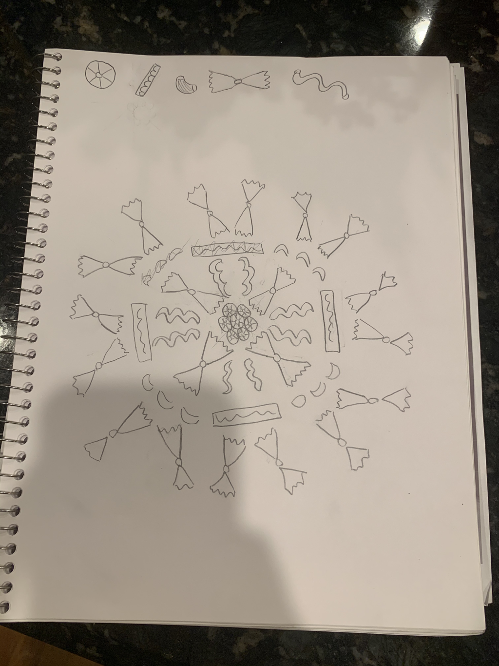
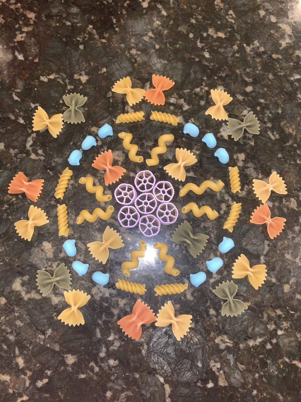
1. This is my project for the object arranger unit. I used different types of pastas and different colors to create a piece of art.
2. In my project I used an assortment or different colors, such as green, red, yellow, purple, and blue. The colors red, green, and yellow, were all colors that were originally on the pasta before I used them in my art. I thought that my piece needed more color, so I painted a couple pieces of pasta blue and purple. 3. My piece has lots of variety in it because, not only does it have lots of different colors, but it also has lots of different shapes of pastas. I thought this was important to have in my piece because it makes the art look more interesting and creative. 4. I was inspired to use pasta as my object in the my piece because I am Italian and with the quarantine my parents have lots boxes of pasta in the house. I thought they would be perfect because there small, different shapes, and colors. 5. I think in my piece I did a successful job of using lots of variety, with colors, shape, and pattern. 6. I learned how to make a piece of art out of everyday objects, and make it interesting/creative. |
